R.I.P. Ronnie Bonner

I just talked to him last month on his birthday. I’d known him for 35 years, and he inspired me all the way through. He ran companies, organized events, fostered communities, and did it all with an infectious smile on his face. With the passing of Ronnie Bonner this week, the world lost an inspiration, BMX lost a legend, and many of us lost a friend.

Ronnie Bonner, me, and Thomas Durdin at Sparky’s Distribution in 2022.

Sometime in 1990, the National Bicycle League hosted a combination BMX freestyle contest and BMX race in my current home of Jacksonville, Florida. The contest was situated in the parking lot of the public library next to the BMX track, so there were races going on alongside the flatland and ramp contests. I met so many people there—Chris “Mad Dog” Moeller (the M of S&M Bikes), Root Girl, Ronnie Anderson, Perry Mervar—faces from magazine pages walking around in a parking lot. The one persistent name from that day was Ronnie Bonner.

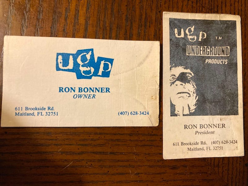
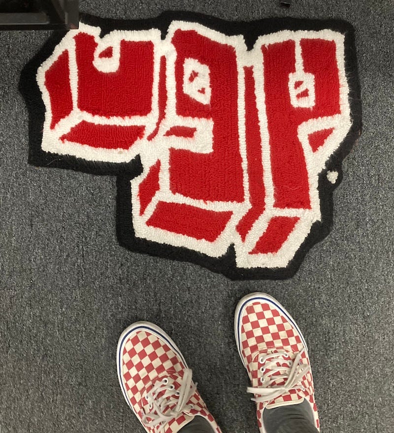
At the time Ronnie was running a company called Underground Products. UGP largely followed the model of BMX entrepreneurship outlined by Bob Haro, making stickers, t-shirts, and number plates, all with a flair unique to Ronnie. I was making zines, stickers, and t-shirts, but at nothing close to the scale of UGP. We traded shirts and numbers and stayed in touch.

Ronnie’s old UGP business cards.

A year or so later, Ronnie and a couple of other BMX riders came up form Orlando to my parents’ house in Alabama. I had a stone-henge-style ramp, a wedge, a yellow parking block, and long PVC pipe for rail slides in our driveway. When the guys arrived late one Friday night, they tried to wake me up by throwing things at my upstairs bedroom window. When they were unsuccessful, they camped out on the ramps. When my dad got up the next morning, he let them in to sleep on the couch and living-room floor.

We had many such weekends over the next 35 years, usually in conjunction with some event that Ronnie organized. Just before moving from Atlanta to San Diego in 2000, I trekked down to Orlando for one of his Roots Jams. Aside from the main event held on multiple ramps and rails shielded from the Florida sun by a giant pavilion, there was the night before out in the city and the night after as well. Ronnie knew how to make the trip to central Florida worth everyone’s effort.

An Underground Products rug at Sparky’s Distribution.

After he sold UGP in 2005, he wasted no time starting new projects. The Shadow Conspiracy and SubRosa quickly rose to prominence with quality products, stellar aesthetics, and innovative marketing. On an Unclicked podcast episode from last year, Ronnie talked about his favorite art form: the art of execution. “Everyone has ideas,’“ he said, “but very few people actually fucking go for it.” Putting your ideas into action is the real art.

The ribbon-cutting at Juvee Hall, August 6, 2022.

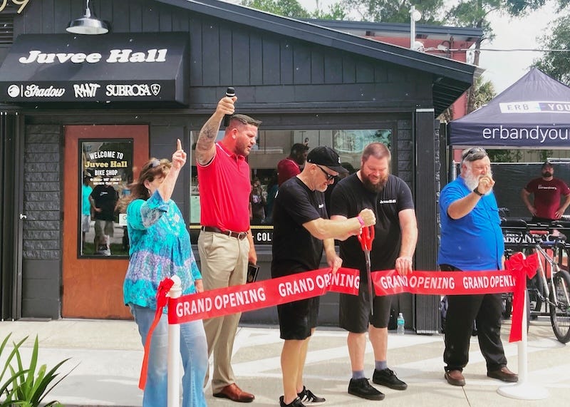
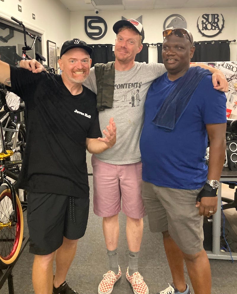
The last time I saw Ronnie was at the opening of his bike shop in 2022. Juvee Hall is in a small building across the street from the warehouse that houses Sparky’s, the distribution arm of Ronnie’s empire, but it boasts a small showroom, repair shop, and an outdoor stage. It’s the only bike shop I’ve ever been to with cold-brew coffee on tap.

Like anyone who knew him, I could go on and on about all the cool things he brought into the world, his never-failing laugh and smile, and all the ideas he executed, but the short of it is that Ronnie Bonner was a mentor, an inspiration, and a friend, and he excelled at all of the above in BMX and beyond. He is already missed.

The Pair I Wear

The first time I got to hang out with the Big Kids, the runt of their already established clique stuck with me. He wasn’t the Cool One. Everyone else was making fun of him, but I was unimpressed by them. First of all, he had a skateboard. To me in the eighth grade, there was little else that was cooler than a skateboard. He had longish hair, a baseball cap, a short-sleeve button-up shirt unbuttoned over a t-shirt, board shorts, and teal Chuck Taylors with band names written all over them. Chuck Taylors are the link between punk-rock and skateboarding. You can’t skate in Doc Martins, but you can mosh in Chucks.

Now, I’d had Chucks before, but the audacity of personalizing them hadn’t occurred to me. Soon, I sprayed my red pair with bleach, leaving a yellow splatter pattern. I added yellow laces to set them off. I took a Sharpie to another pair, and added black laces to match my doodles of zine logos.

Recently, my sister found me a new yellow pair at a thrift store, and I immediately thought of that guy from eighth grade with his crude band-name scribbles.

I took mine a step further by trying to draw the band logos as accurately as possible.

Bands represented include Fugazi, Bad Brains, Unwound, Germs, Circle Jerks, Hüsker Dü, Naked Raygun, 7Seconds, Minor Threat, and Big Black.

Still banned in DC.

Out of Step with the world.

I can only hope I made the bands proud. Impressing the Big Kids is always a lost cause.

First Friday Art Crawl

I have a collection of illustrations and logo designs up for the month of January at Reset Mercantile in Dothan, Alabama. This footage was shot on January 6, 2023 by Ryan Mills for Big as Life Media.

Some of these pieces are also available on Behance, but here’s the flyer from the show.

Reset Mercantile is located at 2407 Montgomery Highway in Dothan, Alabama. The First Friday Art Crawl is January 6th, from 5-8pm, but my drawings are up until the end of the month, so come through if you’re in the area.

Thanks to Justin April at Reset, Ryan at Big as Life, Mike Nagy, and everyone else for coming out.

The Wiregrass Local Podcast

This week I was a guest on The Wiregrass Local podcast with my dude Justin April. We talked about making zines, working on magazines, drawing logos, writing books, and other things we both learned growing up in skateboarding culture.

As mentioned in the podcast, for the month of January, I have a small collection of drawings and designs hanging at Reset Mercantile in Dothan, Alabama. The opening is this Friday, January 6th, from 5-8pm, during Dothan’s First Friday Art Crawl. Some of my pieces are portraits from Follow for Now, Vol. 2, some are pieces from Boogie Down Predictions, some are solicited and unsolicited illustrations and logos, and some are just random scribbles from the past few years. I’ve posted examples of my work on Behance.

Me and Justin April chopping it up live.

Reset Mercantile is located at 2407 Montgomery Highway in Dothan, Alabama. The First Friday Art Crawl is January 6th, from 5-8pm, but my drawings are up until the end of the month, so come through if you’re in the area.

Many thanks to Justin April at Reset and The Wiregrass Local for the opportunity, and everyone who’s come by to see my stuff.

The Medium Picture Object: A Photo Essay

Released in 1979, Douglas Hofstadter’s first book, the Pulitzer-Prize winning Gödel, Escher, Bach: An Eternal Golden Braid, is an expansive volume that explores how living things come to be from nonliving things. It’s about self-reference and emergence and creation and lots of other things. It’s well worth checking out.

For the cover of his heady tome, Hofstadter carved two wood-block objects such that their shadows would cast the book’s initials when lit against a flat backdrop. He went the extra step of working in the initials for the subtitle as well.

Earlier this year, I was inspired to emulate Hofstadter’s sculpture. I found a way to put the initials for my media-theory book-in-progress, The Medium Picture—TMPinto a similar configuration. This is one of my early sketches.

The sketches I did at least made the thing appear possible, so I started exploring physical options. After trying different materials and digging around craft stores, I finally found some letters that were about the right shape and would save me a lot of time toward the final object.

I was fortunate to find letters with similar proportions to the ones I’d been drawing. The first thing was to cut the M to make the P the top of the T. Like so:


After some papier-mâché tweaking, calk to round the leg of the M, and a coat of white paint, the object was ready to test.


Now that it physically existed, I knew the real test would be hanging it, lighting it, and capturing its shadows correctly. I built a contraption for just that out of things found around my parents’ house.

It was as sketchy as it looks. The object was suspended with two pieces of fishing line, and I had to turn off the air conditioning to get the thing to hang still for the picture. I found some pieces of foamcore in my sister’s old closet for the backdrop and gathered up tiny flashlights from all over the house.

With the LED flashlights propped and taped in place, this is the final set-up.

And this is the final shot. It’s not quite as intricate or as elegant as Hofstadter’s, but I’m pretty stoked on it. I think it will make a striking cover image and a fitting tribute to his work.

I belabored this process here because about half the people who see the final image ask me what software I used to make it. I know this could’ve been done digitally in any 3-D imaging suite, but I wanted to make it for real, just as Douglas Hofstadter had done.

dälek Logo Design

Sometimes they take a while to come together… Unlike my HKRB logo, which came together overnight, this one’s been brewing for over a year. dälek is one of my all-time favorite groups, and I’ve known them for a minute now. Though unsolicited, it was an honor to finally put something like this together.

As I often do, I started with similarities in the first and last letters. Though the D and the K can be drawn structurally similar, the going was rough at first. I had to let it marinate.

When I came back to it the other day, I found a few new ways to bring the letters together.

Hollowing them out gave it a bit more life, but it still wasn’t quite there.

Much like my Alaska logo, once I found the X in the background, I knew I had it.

I tried a few more iterations after this one, attempting to make the D a bit stronger, but I like this one the best. I even went back to the very straight, less organic style I started with, and this is still the best version. It’s live, it’s dangerous, it’s like the band it represents.

Genre Trouble: Post-Rock and Other Lost Sounds

Even with a space seemingly cut out for them by a family of description-defying groups, ready-made genres, and audiences lying in wait, some sounds still just seem to don’t fit anywhere. As I wrote previously about another post-something band, when genre-specific adjectives fail, we grasp at significant exemplars from the past to describe new sounds. Following Straw (1991), Josh Gunn (1999) calls this “canonization” (p. 42): The synecdochical use of a band’s name for a genre is analogous to our using metaphors, similes, and other figurative language when literal terms fall short. Where bands sometimes emerge that do not immediately fit into a genre (e.g., Godflesh, Radiohead, dälek, et al.) or adhere too specifically to the sound of one band (e.g., the early 21st-century spate of bands that sound like Joy Division), we run into this brand of genre trouble.

Mogwai live [photo by Leif Valin]
Pedal power: Mogwai live. [photo by Leif Valin]
Storm Static Sleep by Jack-ChuterPost-Rock would seem to be just such a genre. Ever since Simon Reynolds etched the term into the annals of music journalism, there has been a post-everything-else. Sometimes it’s just lazy writing, sometimes it’s for marketing purposes, and sometimes a genre has truly emerged alongside its parent designation. Regardless, in Storm Static Sleep: A Pathway Through Post-Rock (Function Books, 2015), Jack Chuter tries to get to the bottom of all things post-rock, even devoting an entire chapter to Reynolds himself. There seems to be very little consensus on exactly where Rock crossed the line and became something else. The roots of the genre run deep and in many directions (e.g., Prog, Brian Eno, Jazz, CAN, PiL, Industrial, Jim O’Rourke, et al.), and Chuter goes as far back as the New Romanticism of Talk Talk and its separate ways before moving on to Slint and Slint-inspired rock.

If any band is worthy of its own genre, it is Slint: a band certainly more talked-about than listened-to. About such talking-about and genres as they emerge in writing, Lisa Gitelman (2014) writes,

As I understand it, genre is a mode of recognition instantiated in discourse. Written genres, for instance, depend on a possibly infinite number of things that large groups of people recognize, will recognize, or have recognized that writings can be for (p. 2).

As Star (1991) and Gunn (1999) describe canonization above, Gitelman contends that genres emerge from discourse. Subsequently, we internalize them. They are inside us. She continues,

Likewise genres—such as the joke, the novel, the document, and the sitcom—get picked out contrastively amid a jumble of discourse and often across multiple media because of the ways they have been internalized by constituents of a shared culture. Individual genres aren’t artifacts, then; they are ongoing and changeable practices of expression and reception that are recognizable in myriad and variable constituent instances at once and also across time. They are specific and dynamic, socially realized sites and segments of coherence within the discursive field (p. 2).

Sounds of the UndergroundChuter’s pathway through Post-Rock also goes as far out as the Post-Metal of Neurosis and Isis, and as current as 65daysofstatic, God is an Astronaut, and This Will Destroy You. Just when you think Post-Rock is too narrow a designation for a book-length exploration, with a quick list one sees how wide its waves crash.

Further mapping the fringes, Sounds of the Underground (University of Michigan Press, 2016) by Stephen Graham covers everything from extreme noise to black metal, and from hardcore improvisation to the festivals and venues that host them. Graham distills a massive amount of cultural, political, and aesthetic history into his investigation, and his attention to the means of production, the shifting control thereof, changes in consumption, and the lack of change in content are all paramount to the story.

Graham concludes by writing, “whatever boundaries I’ve laid down should be understood as liquid and tentative” (p. 243). Noting the gauziness of genre doesn’t necessarily negate the pursuit of classification. As radically subjective as music fandom can be, it’s nice to have some signposts. These two books are maps made of many.

References:

Chuter, Jack. (2015). Storm Static Sleep: A Pathway Through Post-Rock. London: Function Books.

Gitelman, Lisa. (2014). Paper Knowledge: Toward a Media History of Documents. Durham, NC: Duke University Press.

Graham, Stephen. (2016). Sounds of the Underground: A Cultural, Political, and Aesthetic Mapping of Underground and Fringe Music. Ann Arbor, MI: University of Michigan Press.

Gunn, Josh. (1999, Spring) Gothic Music and the Inevitability of Genre. Popular Music & Society23, 31-50.

Straw, Will. (1991). Systems of Articulation, Logics of Change: Communities and Scenes in Popular Music. Cultural Studies, 5(3), 361-75.

——–

Apologies to Josh Gunn for the title of this post.

HKRB Logo Design

My friend Alfie Bown runs the Hong Kong Review of Books. In addition to running some of my illustrations, he recently asked me to come up with a new logo for the site. I woke up a few days later with an idea.

HKRB logo sketches

Somehow the shapes in the negative space of the letters just fell into place.

HKRB logo

The B was the only part I struggled with since it looked more like an 8 in my original sketches. The other letters seemed obvious. I hinted at more of a B-shape by having the background outline bisect the circles. It’s still the weak point in the legibility of the logo but also possibly the most visually interesting part.

Here it is with some color:

HKRB grey/yellow logo

And then I did one more iteration for good measure:

HKRB logo final

This is only my second requested logo design (Rapper friend Alaska was the first). Thanks to Alfie Bown for the opportunity.

Fallen Footwear Logo

Since I don’t have enough to do lately, I started working on another unsolicited logo design, this time for my friend Jamie Thomas’s company Fallen Footwear.

It started, as many of these do, with my waking up with part of it in my head. This time it was the middle Ls. As you can see in the rudimentary sketches on the left in the picture below, they form an arrow pointing down. That was to be the guiding visual concept for this design, which evolved over two weeks of intermittent sketches and doodles.

Fallen logo-sketches

As it came together through the various versions above, I realized it needed some more space. This is what I ended up with:

Fallen logo rough

Once I had that one drawn, it felt kind of empty, too sparse for this particular logo, so I tried filling it out a bit more, and I got this one:

Fallen logo-with grey

Seeing them together like this, I actually like the spindley middle one best. I think the ideal version might be somewhere between it and the more organic one at the bottom. Maybe another iteration is in order.

Illustrations for the Hong Kong Review of Books

Thanks to Alfie Bown, I am now doing illustrations, like the one below of Umberto Eco, for the Hong Kong Review of Books.
Umberto Eco

This sketch was done from his photo on the cover of MIT Press’s reissue of his 1977 book, How to Write a Thesis (MIT Press, 2015). I’ve been experimenting with quick sketches with very little planning, partly to capture that hot space, and partly because I just don’t have time to do the kind of labor-intensive drawing I want to do.

Thanks to Alfie and the HKRB! Umberto Eco, R.I.P.